CheckoutWC 3.0 Released

Today we’re excited to announce the release of CheckoutWC 3.0. If you’re an existing customer, you know that we released 3.0 a few weeks ago and are now on version 3.3. But here’s the thing: We didn’t get* a** chance*** to write an official announcement for 3.0, we’re going to use this opportunity to document what we’ve been working on.
As a result, some of the things we discuss here come from the current version of 3.x, not the released 3.0 version.
*properly **prioritize ***our time
3.0
3.0 was our biggest release since October 2018.
Software development is a constant process of learning and adjustments, and with 3.0 we had the perfect opportunity to synthesize everything we have been learning and establish a new foundation for future development.
Feature Highlights
New Template Structure
CheckoutWC was originally designed as a one template system. We knew we would probably add additional templates at a future date, but we didn’t build a templating foundation to make that easy.
With 2.0, we forced a proverbial square peg into a round hole to get our initial templates working.
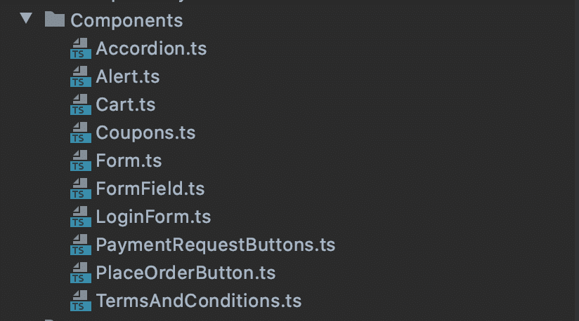
In 3.0 we totally rewrote our templating system. We eliminated 90% of our code duplication, increased standardization, and improved how we treat template specific settings.
Templates now are driven entirely by action hooks. If you aren’t super familiar with action hooks, the best way to think of them is a queue of work to do.
So for instance, this is the code we use to output the customer information tab for every template:

That just feels clean doesn’t it?
And it’s super configurable. It’s easy for developers to remove elements they don’t like and replace them, or to insert something in between our blocks.
The new template structure made it easy to add a….
New Template
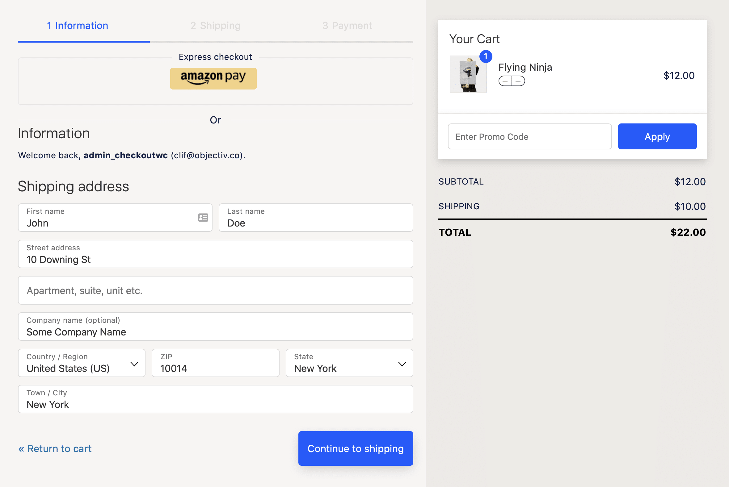
In 3.0, we added a brand new theme: Glass
We were inspired by a customer’s design concept and they graciously gave us permission to build it as a new template.
It has a different take on the breadcrumbs, with a checkbox appearing for each completed step:

We are going to be taking this concept further with future templates.
Re-designed Cart

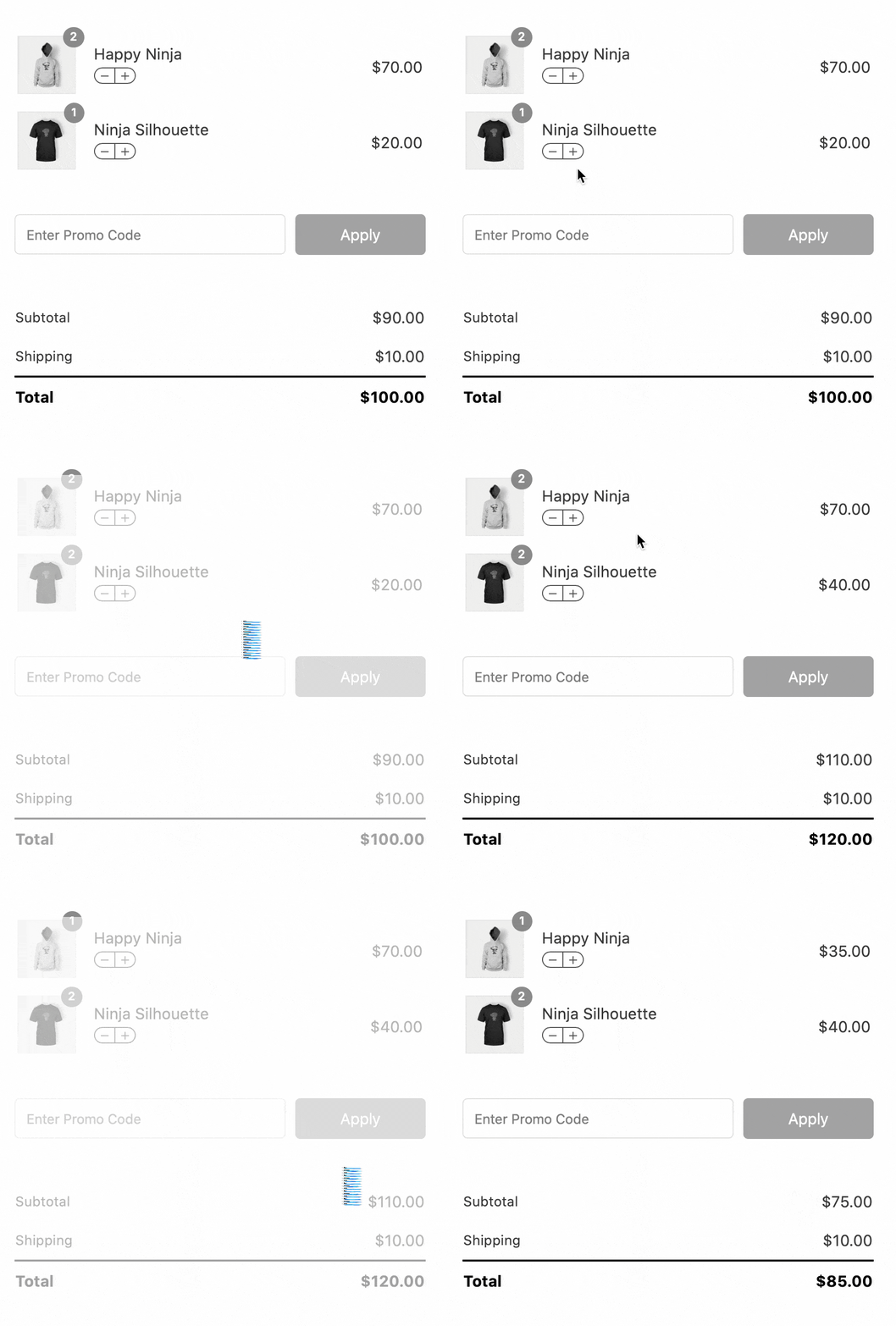
We refactored our cart design to simplify the layout, remove duplication, and simplify the way variation and custom field data is rendered.
We eliminated dropdown and modals for cart editing, settling instead on a simple – / + stepper control.
We love it!
Modular CSS and JS
In 3.0 we also made our CSS and JS modular.
Each distinct block on the checkout page has its own CSS and JS modules. Gone are the days of coupled functionality. Gone are the whack-a-mole debugging sessions where in the functionality of one aspect of the checkout page had unintended consequences for other features.

More Options
One of the things we committed to from day one was the WordPress core philosophy of decisions, not options.
We intended (and still do) to be highly opinionated about the proper way a checkout page should function.
We chose to use development actions and filters to allow for deeper customization.
But here’s the thing: Sometimes options are a good thing.
And nothing reinforces that concept like using your own product. We found ourselves annoyed at having to lookup snippets to do simple things and we understood a little bit about what our customers were going through.
So in 3.0, we added options to control many simple aspects of setting up your checkout page:
General Options
- Login Style: Switch to the default ‘Login Reminder’ banner or our enhanced login lookup control.
- Registration Style: Allows you to require customers to enter a password when creating an account.
- Field Label Style: Some people don’t love floating labels. This allows you to switch to standard field labels.
- Cart Item Label: Decide whether cart items should be links to the product page.
- Cart Item Data Display: Determine how verbose the cart item data (such as variations and custom fields) should be.
- Order Notes: Enable or disable the order notes field.
- Mobile Credit Card Logos: Most of the time, credit card logos don’t really display well on mobile devices, but for the times they do you can now enable them right from settings.
Premium Features
- My Account: Determine whether the thank you page template is used when viewing orders from My Account.
- PHP Snippets: Use a fully functional PHP editor to add quick snippets and overrides instead of editing functions.php or using a separate plugin.
Design
- Body / Heading Fonts: Choose from any Google Font and set your fonts right from settings.
- More Color Overrides: Set things like button hover colors, cart item colors, etc.
Performance
Performance is always our highest priority.
So many plugins for WooCommerce end up hopelessly bloated, as each new feature requires large amounts of code and evaluations to produce.
We strive for the opposite: stateless, easy to render elements that just work, with minimal reloading.
We aren’t 100% where we want to be, but we’ve noticed a good trend: The checkout page is awesome the fastest page on our customer’s sites.
And a lot more.
CheckoutWC 3.0 was a labor of love comprising hundreds of commits.
We tweaked things like font rendering and letter spacing. We switched to an established grid framework, ditching our custom one.
This also improved our responsive styling. The break points for desktop, tablet, and phone sizes are now consistent across the board. We re-tested every size and tried to be thoughtful about what each device needed to provide the best experience.
A word about the future.
This is where we’re at now, and we’re really excited.
But we have more planned for the future:
- More Templates: We’re going to work with rockstar designers to design new templates.
- Easier block addition: We’re going to implement a sidebar style approach to customizing blocks on the checkout page. So you will be a able to add disclaimers, trust badges, etc without any code.
- Faster performance: We’re going to minimize page refreshes and make switching tabs faster.
We’re also working on a rebrand. We have a new logo, new site design, and better documentation coming in the next few weeks.
We’re also going to share more insights about how many sites are using CheckoutWC and how much revenue we’re processing. (All from opted-in, anonymous stat collection of course!)
Thanks for helping us make CheckoutWC better every day. We rely on our customers patience, insights, and experiences on a daily basis as we improve CheckoutWC.
We want CheckoutWC to be the absolute best and easiest checkout experience for WooCommerce.
It’s honestly an addiction at this point and we couldn’t stop if we wanted to. ?

